

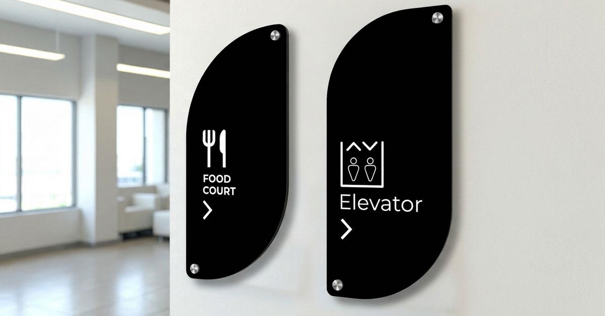
The Strategic Design of Wayfinding: Optimizing Directional Signs for High-Traffic Sites
In the competitive South African commercial sector, the efficiency of your property's navigational system directly impacts your professional reputation. While basic markers might suffice for minor office layouts, high-traffic environments, such as sprawling industrial sites, retail centers, and multi-story corporate parks, demand a strategic approach to commercial directional signs. Precision-engineered directional signage eliminates the friction of modern travel, ensuring that every visitor's journey is as intuitive as possible from the moment they enter your gate.
Last Updated: 19 August 2026
Table of Contents
1. Advanced Wayfinding Principles for Professional Directional Signage
Effective wayfinding is more than a sequence of markers; it is a comprehensive communication strategy. To maximize the utility of your directional signs with arrows, your signage schedule must focus on progressive disclosure. This design philosophy ensures that visitors are not overwhelmed with too much information at once, but instead receive clear, concise guidance at every critical decision point. Proper directional signage reduces confusion and enhances the overall visitor experience.
2. Designing High-Performance Directional Signs with Arrows
For navigational cues to be truly effective, they must be processed by the human brain in milliseconds. Elite directional signs design for the South African commercial market relies on these technical foundational principles:
2.1 Visual Consistency
Every directional sign must adhere to a unified design language. Consistent use of typography, color schemes, and arrow styles allows visitors to subconsciously identify wayfinding markers as they move through a complex facility. This consistency builds trust and reduces cognitive load.
2.2 Geometric Precision with Engineered Composites (ACM)
Utilizing Engineered Composites (ACM) ensures that your directional signs panels remain perfectly flat and architecturally sharp. This superior substrate provides a professional look that traditional materials like corrugated plastic or thin steel cannot replicate. ACM is the preferred material for high-end directional signage in South Africa.
2.3 Optimized Legibility for South African Conditions
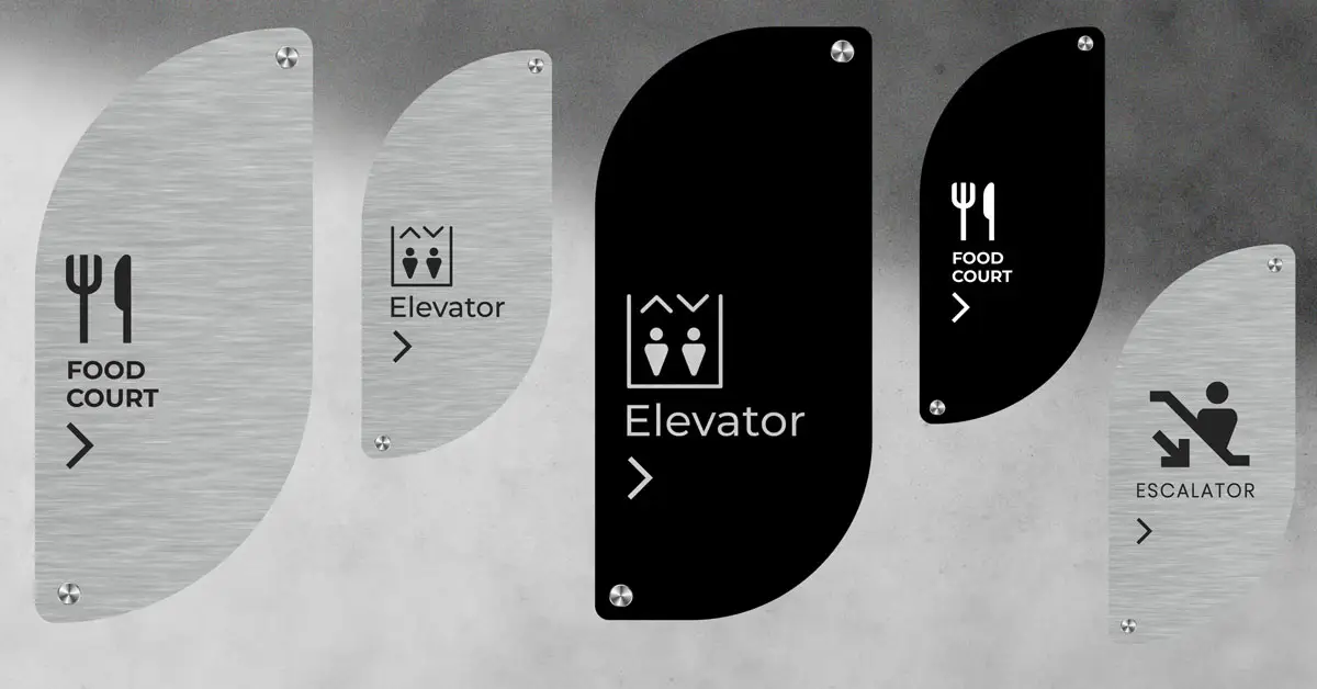
Directional signs with arrows should prioritize high-contrast color combinations, such as matte black text on brushed aluminium. This ensures readability under various lighting conditions, including the intense glare of South African mid-day sun. High-contrast directional signage improves safety and accessibility for all visitors.
2.4 Strategic Placement at Decision Points
Effective directional signs are located precisely at "choice points", intersections, lobby splits, and gated entries where navigational hesitation is highest. Proper placement of directional signage can reduce visitor confusion by up to 60% in complex commercial properties.
3. Operational Efficiency Through Intelligent Wayfinding
In large-scale industrial and commercial developments, poor wayfinding is more than an inconvenience; it is an operational bottleneck. Clearly identified directional signage reduces the time delivery couriers spend searching for loading zones and ensures that emergency services can navigate a campus without delay. By investing in professional, durable directional signs, property managers can significantly improve the daily flow of both pedestrian and vehicle traffic, enhancing the overall safety and functionality of the site.
Well-designed directional signs with arrows can reduce delivery times by up to 30% and improve emergency response times in critical situations.
4. Frequently Asked Questions About Directional Signs
This authoritative section provides expert insights into the design and implementation of professional directional signage for modern properties.
What is the most important factor in directional sign placement?
Strategic placement at decision points is the most critical factor for directional signage effectiveness. Signs must be installed precisely where visitors naturally hesitate, such as entrance gates or corridor intersections. For maximum impact in South African commercial offices, these directional signs should be positioned at eye level (1,400mm to 1,600mm) to ensure immediate visibility before a wrong turn is made.
How should arrows be positioned on directional signs with arrows?
Arrows must point away from the text and align directly with the physical direction of the destination. Professional wayfinding standards dictate that the standard sequence from the center of the directional sign outward is text, icon, and finally the arrow. An arrow pointing to the right should be positioned on the right side of the directional signage to reinforce the directional cue and prevent cognitive load.
When should a downward-pointing arrow be used on signage?
A downward arrow should only be used to indicate "straight ahead" if there is an immediate downward gradient like stairs. In all other scenarios indicating straight-ahead movement, an upward-pointing arrow is the industry standard for directional signs. Consistently applying this rule across all floor levels prevents navigational errors and ensures the safety of pedestrian traffic within complex multi-story structures.
Why are Engineered Composites (ACM) preferred for directional signs?
Engineered Composites like ACM are favored for their superior durability and perfectly flat architectural finish. Aluminium Composite Material is lightweight, UV-stable, and entirely rust-proof, which is essential for the South African climate. Unlike traditional steel, ACM does not rust or warp, ensuring a premium professional look that remains maintenance-free for decades in high-traffic environments. South African National Standards (SABS) recognize ACM as a preferred material for commercial directional signage.
What font types are best for directional signage?
Sans-serif fonts are the preferred choice for directional signage due to their superior legibility from a distance. Clean typefaces like Helvetica or Arial offer excellent readability under different lighting conditions and for people in motion. Maintaining high contrast between the text color and the background color further enhances visibility for all visitors, including those with visual impairments.
Should directional signs include Braille for accessibility?
Yes, any directional signs installed within lateral reach should include tactile text and Braille for SANS 10400-S compliance. Inclusive wayfinding ensures that commercial facilities are navigable for persons with visual impairments. This commitment to accessibility is a standard requirement for modern building occupancy inspections and demonstrates that your business takes safety and compliance seriously.
What is the benefit of using symbols on directional signs?
Symbols bridge language barriers and allow for faster cognitive processing of navigational information. Accompanying directional signs with arrows with universally recognized icons, such as the wheelchair symbol for accessibility or an elevator icon, ensures that the message is understood by all visitors regardless of their primary language. This improves the overall visitor experience and safety.
How does professional wayfinding improve business credibility?
Professional wayfinding enhances credibility by creating a seamless, stress-free visitor experience that reinforces your brand identity. When a visitor can navigate a property intuitively, it builds trust and confidence in the business. Consistent, high-quality directional signage reflects an attention to detail that elevates the perceived value of the entire commercial premises.
What are the four main types of wayfinding signage?
Wayfinding signage typically falls into four categories: directional, informational, identification, and regulatory signs. Directional signs guide users toward their destination, while informational signs provide details about a space like maps. Identification signs confirm specific locations, such as room names, and regulatory signs communicate essential safety rules and legal compliance information for the facility.
Can directional signage help with traffic patterns on a property?
Well-placed directional signage significantly influences traffic patterns by encouraging the use of specific, efficient routes. This prevents congestion in high-traffic areas, reduces the risk of accidents, and improves the overall flow of vehicles and pedestrians. By guiding drivers and visitors along the best paths, businesses can ensure property efficiency even during peak operating times.
5. Quick Answers: Directional Signs Essentials
- Best material for outdoor directional signs in SA: Engineered Composites (ACM) offer rust-proof, UV-stable durability.
- Ideal height for directional signs: 1,400mm to 1,600mm for eye-level visibility.
- Minimum contrast ratio for accessibility: 70% between text and background.
- Typical lifespan of ACM directional signs: 20+ years with minimal maintenance.
- SANS 10400-S compliance: Braille and tactile text required on signs within lateral reach.
- Best font for directional signage: Sans-serif fonts like Helvetica or Arial.
6. Get a Professional Signage Quote for Your South African Property
Every commercial development has unique navigational requirements. Whether you need a single directional sign with arrows or a comprehensive wayfinding schedule for a new build, we provide tailored, durable solutions engineered for the South African climate. Our directional signs are designed to withstand the harsh South African sun and deliver decades of reliable service.
Contact us today to get a quote for your custom architectural signage requirements. We serve commercial properties across Johannesburg, Cape Town, Durban, and nationwide.