

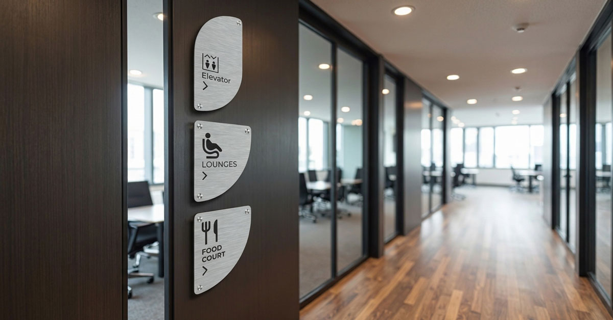
Navigational Excellence: The Professional Guide to Directional Signs with Arrows
Last Updated: 19 August 2026
Effective property management and corporate branding rely on more than just high-visibility storefronts; they require a seamless user journey. Directional signs act as the silent navigators of your premises, removing visitor hesitation and improving site safety. In the South African commercial landscape—from bustling Sandton office parks to sprawling industrial warehouses—precision-engineered directional signs with arrows are essential for creating an intuitive flow of movement for pedestrians and vehicles alike.
Table of Contents
- 1. The Strategic Role of Directional Signs in Modern Wayfinding
- 2. Designing High-Impact Directional Signs with Arrows
- 3. Common Applications for Directional Signage in South Africa
- 4. Frequently Asked Questions About Directional Signs
- 5. Quick Answers: Directional Signs Essentials
- 6. Get a Professional Signage Quote
1. The Strategic Role of Directional Signs in Modern Wayfinding
Wayfinding is the balance between terminology, symbols, and consistent placement to help people of all abilities navigate unfamiliar spaces. High-quality directional signage does more than point the way; it reduces stress at critical decision points like entrance gates, lift lobbies, and corridor splits. Professional directional signs are the foundation of any effective property navigation system.
2. Designing High-Impact Directional Signs with Arrows
For a directional sign to be effective, its design must prioritize immediate legibility over clever wording. To maximize the impact of your signage schedule, follow these professional design principles for premium directional signage:
2.1 High Contrast
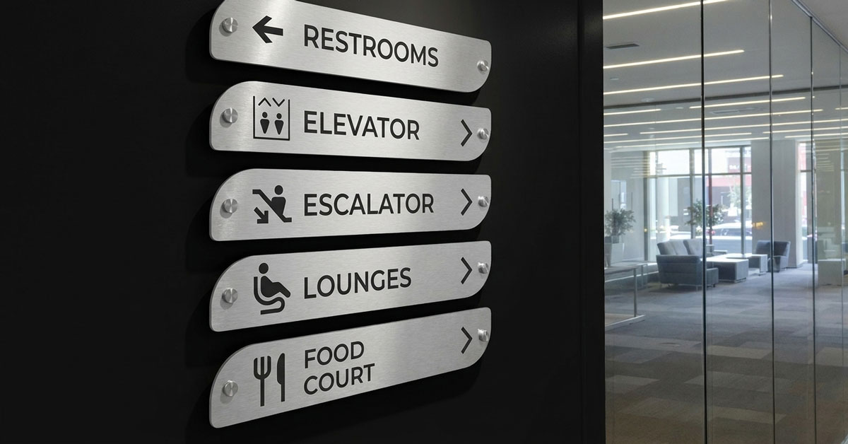
Utilize bold, high-contrast colors (like matte black on brushed aluminum) to ensure legibility even in low-light conditions. High-contrast directional signs with arrows are essential for South African commercial properties where lighting conditions can vary dramatically.
2.2 Universal Symbols
Combine directional signs with arrows with universally recognized icons to bridge language barriers in South African public spaces. Symbols improve wayfinding efficiency for all visitors, regardless of their primary language.
2.3 Clean Typography
Stick to sans-serif fonts like Arial or Helvetica, which offer superior readability for people in motion. Clean typography ensures that your directional signage is legible from a distance and under various lighting conditions.
2.4 Material Selection
While Chromadek steel is cost-effective for construction sites, premium corporate environments demand Engineered Composites (ACM) for their sleek, flat, and rust-proof finish. ACM is the preferred material for high-end directional signs in South Africa.
3. Common Applications for Directional Signage in South Africa
Professional wayfinding is a necessity across various sectors to ensure efficient pedestrian and vehicle flow. High-quality directional signage enhances safety, reduces confusion, and improves the overall visitor experience in these common applications:
- Corporate Offices: Guiding visitors from reception to specific rooms or department zones with clear directional signs.
- Retail Centers: Directing customers to key departments, amenities, or parking areas using professional directional signage.
- Residential Estates: Identifying specific block numbers or communal facilities like clubhouses and gyms with durable directional signs.
- Industrial Sites: Providing clear safety guidance and site directions to loading zones or warehousing areas.
4. Frequently Asked Questions About Directional Signs
This authoritative section provides expert insights into the design and implementation of professional directional signage for modern South African properties.
What is the most important factor in directional sign placement?
The most useful directional signs must be installed at "decision points"—locations where visitors naturally hesitate, such as entrance gates, corridor splits, or elevator lobbies. For maximum effectiveness in South African commercial office parks, these directional signs should be positioned at eye level (1,400mm to 1,600mm) to ensure immediate visibility before a wrong turn is made.
Why are Engineered Composites (ACM) preferred for directional signs?
Aluminium Composite Material (ACM) is the gold standard for directional signage because it is lightweight, UV-stable, and entirely rust-proof. Unlike traditional Chromadek or solid steel, ACM provides a perfectly flat architectural finish that won't warp or pit, making it ideal for the high-humidity coastal climates of Cape Town and Durban. South African National Standards (SABS) recognize ACM as a preferred material for commercial directional signs.
What font size is required for directional signs with arrows?
Font size is dictated by viewing distance; for standard indoor corridors, a minimum capital letter height of 50mm is recommended. For outdoor directional signs with arrows intended for vehicle navigation, high-contrast color combinations (like matte black on brushed aluminium) and significantly larger typography are mandatory to ensure safety and legibility from a distance.
Should directional signs include Braille for accessibility?
Yes, to maintain inclusivity and meet modern building standards, any directional signs mounted at hand-height within hallways or beside doors should feature tactile text and Braille for SANS 10400-S compliance. This ensures that your facility is navigable for persons with visual impairments, aligning with general accessibility guidelines.
Can directional signage be customized to match corporate branding?
Absolutely. While clarity is the priority, professional directional signage can be precision laser-cut into custom geometric profiles and finished in brand-specific matte or metallic coatings. Utilizing engineered composites allows for the integration of corporate logos and custom fonts without sacrificing the structural durability required for high-traffic environments.
5. Quick Answers: Directional Signs Essentials
- Best material for outdoor directional signs in SA: Engineered Composites (ACM) offer rust-proof, UV-stable durability.
- Ideal height for directional signs: 1,400mm to 1,600mm for eye-level visibility.
- Minimum font size for indoor signs: 50mm capital letter height.
- Minimum contrast ratio for accessibility: 70% between text and background.
- Typical lifespan of ACM directional signs: 20+ years with minimal maintenance.
- SANS 10400-S compliance: Braille and tactile text required on signs within lateral reach.
6. Get a Professional Signage Quote for Your South African Property
Every commercial development has unique navigational requirements. Whether you need a single directional sign with arrows or a comprehensive wayfinding schedule for a new build, we provide tailored, durable solutions engineered for the South African climate. Our directional signs are designed to withstand the harsh South African sun and deliver decades of reliable service.
Don't allow poor wayfinding to compromise your property's professional standards. We serve commercial properties across Johannesburg, Cape Town, Durban, and nationwide.
Contact us today to get a quote for your custom architectural signage requirements.